
November 7th, 2019
Painting in a Visual (Abstract) Medium
Justin Davis, MBBS

Justin Davis, MBBS, is a Chief Resident at Barwon Health in Geelong, Australia.
I’m not creative. I wish I were. I listen to music (with my particular choices being classical and music from video games) and wonder to myself how people are able to come up with such amazing pieces of art and media. I’ve tried it myself. I used to play piano back in med school, before the constant house moving and having to pay to get the piano moved separately and tuned each time made it non-financially viable (my old piano is elsewhere now, and my current time is taken up by way too many non-creative things to realistically pick it back up). I tried to create music, tried to rack my brains to come up with something. But my brains just won’t rack, not in that way. In a similar fashion, I don’t learn in a visual manner. I’ve seen people draw beautiful flow charts and mind maps while they were studying, but mine are simply walls of text with nary a colour, paragraph, or picture in there. It’s just how I work.
Which brings me to today’s topic and why I find it rather fascinating that use of the visual abstract is increasing in social media to create engagement as well as to disseminate scientific information. If you haven’t heard of visual abstracts, it might be because they are a relatively new thing — only a mere 3 years old. They were first coined by a clever chap by the name of Andrew Ibrahim who showed that use of these constructs on social media platforms increased engagement with the post compared with a simple text-based design, despite them carrying essentially the same information. (Regular readers of my blog posts may have noticed there’s a social media theme here once again. In my earlier discussion of the Nephrology Social Media Collective (NSMC) and the fantastic work they do promoting free online medical education through social media, I failed to mention that the NSMC has strongly taken up use of visual abstracts and are actively teaching others how to make them.)
When you stop to think about it, why wouldn’t visual presentations be better? How many of us have stood there, bored in a line, waiting for coffee or public transport or whatever it might be, and scrolling through Instagram or Reddit? These platforms are visual places. Things catch your eye, and you stop to read more about them. It’s so much easier to blithely scroll past several posts that are just blocks of text than it is to pass something that is colourful, creative, and (especially in our case) conveying important results of the study in an easily digestible fashion. A social media platform can be used for some amazing online education, but it is the same platform that can be shallow and cause your personal presentation to be easily missed if it’s simply conveyed in text. And we wouldn’t want that, now would we?
This way of disseminating information is becoming increasingly common. You may have noticed The New England Journal of Medicine, for example, doing just that. A quick perusal of NEJM’s twitter feed reveals several visual abstracts pertaining to some recent articles, such as the article about transcatheter aortic valve replacement in low-risk patients, to pick one example. The same information as the text. A better style of presenting it.
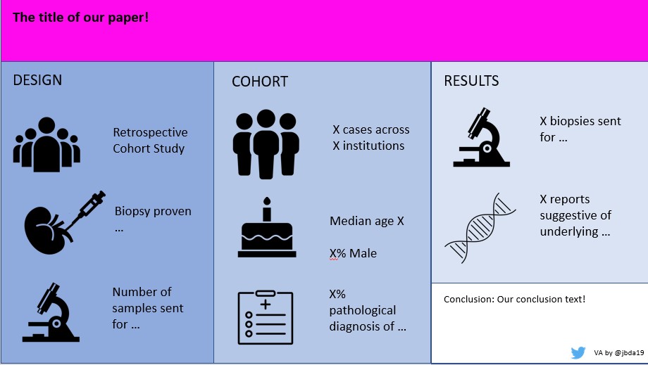
An example of a visual abstract I’ve done for an ongoing manuscript (hence the removal of certain pieces of text. You understand).
You might wonder why I talked about creativity at the beginning of my blog post. One reason — I like to start my post with something relatable (although I’m sure many of our constant readers are much more artistically talented than I am), but another reason was to convey that I don’t think you have to be creatively minded to design and produce an engaging visual abstract. Don’t get me wrong — it doesn’t hurt! I’m sure the ones I have created have terrible colour choices that clash and a layout that definitely could be improved on with some creative flair. But despite my total lack of creativity, I can still produce an abstract which is probably kinda ok. Because, like reading and playing music, they follow a structure (which again, I’m sure others can and have improved on, but my type A personality brain just doesn’t stretch in that fashion) to convey their information, which can be replicated. And while there is a learning curve as to what is/isn’t important and how to convey information in a minimalist manner, once you get the basic components of it down, it’s definitely something many people can pick up and use to produce amazing work. You can even make them in PowerPoint, that staple of presentations everywhere.
I’m fortunate once again that during my NSMC internship, I was mentored in the use of visual abstracts, and completed a project in which we produced them for various publications and honed our skills. I’ve even started to incorporate them into my manuscript submissions to journals as I feel that such things only serve to strengthen a paper (please see one slightly redacted version here — it’s a work in progress). I certainly find them a lot easier to read and engage with on Twitter or other social media platforms. And perhaps you do, too? (It’s slightly ironic, isn’t it, that I’ve written a wall of text in order to champion a simple minimalist visual format? Ah, well).
“You can see everything. You can unsee nothing.”

2021-2022 Chief Resident Panel
Abdullah Al-abcha, MD
Mikita Arora, MD
Madiha Khan, DO
Khalid A. Shalaby, MBBCh
Brandon Temte, DO
Resident chiefs in hospital, internal, and family medicine
Learn more about Insights on Residency Training.
 NEJM Journal Watch – Recent General Medicine Articles
- New Terms to Describe the Steatotic Liver
- Does Lowering High Childhood Lipid Levels Prevent Adverse Cardiovascular Events in Adulthood?
- Minimizing Gestational Weight Gain Appears to Be Safe for People with Obesity
- Long-Acting Octreotide Reduces Bleeding in Patients with Gastrointestinal Angiodysplasia
- Correction: A Next-Generation Version of the Multitarget Stool DNA Test (Cologuard)